Wednesday, September 29, 2010

Join me!

Today, I'll be visiting the Zhush http://thezhush.blogspot.com/2010/09/summer-style-secrets-hamptontoes.html me for her last "Summer Secrets" post of the season. The Zhush is a daily read for me...she covers it all from fabulous interiors to stylish fashions, Chanel anything and everything, and all that might peak the interest of a reader. I adore "the Zhush", both the blog and the lovely person behind the daily posts!
Hamptontoes & the Zhush

Tuesday, September 28, 2010

Two grandsons & their bedroom

This particular set of grandparents coverted two spare bedrooms into special retreats for their grandchildren. One for their grandsons and one for their granddaughters. For their grandsons they desired to create a handsome room infused with a little youthful appeal.

Two matching beds, two different superheros, one chic chair, one shadowbox (made by the grandfather) and a fabulous paint job to create an inviting space for a three and six year old!   

The room is chic and youthful, yet not too juvenile.  

There is a lot of effort that goes into designing, creating and executing a space, so I always champion a timeless room that is sprinkled with transitional touches. You too?      

Monday, September 27, 2010

It's raining!

Let me grab my umbrella and rain boots...

What a fun and whimsical umbrella stand!
http://www.zgallerie.com/ 

Friday, September 24, 2010

Interior design inspiration

People often ask me what inspires me when designing interiors. 
L to R: Lisa w/ Hamptontoes, Elizabeth w/ Pretty Pink Tulips, Ashley w/ Asha, Sue w/ the Zhush & Carolyn w/ The Buzz
A homeowner's wardrobe can be a strong indicator as to the type of style championed. Is the home inhabited by one who dresses elegantly and timeless, is it one who loves a modern day take on classics, perhaps the individual loves some splashes of glamour and fun in their ensembles, do they dress in neutral with bold accessories or maybe the homeowner dresses with a bohemian sense of style? 

Last night I had some fun "stepping out" for a couple of hours to join some lovely blogging buddies for a fashion show. We attended the Carlisle & Per Se Fashion Show in Greenwich sponsored by Connecticut Cottages and Gardens http://www.ctcandg.com/. Carolyn of  http://thebuzz.dianejameshome.com/ modeled fashions with her lovely sister and mother...they were fabulous! 

The evening reminded me that fashion (just one of my many influences) and interior design are closely related. What inspires you when pulling together an interior space? 

Tuesday, September 21, 2010

Roman blinds

When it comes to windows that face a street, I usually gravitate towards top down/bottom up or up/down Roman blinds. Are you familiar with this type of blind? Depending on the manufacturer of the window treatment it is referred to slightly different, but basically it is a Roman blind that can raise from the bottom to the top/middle (first image) or it can be lowered from the top to the bottom/middle (second image.)

Here are the blinds in my son's bedroom.  
A close-up of the navy/white striped textile.
The benefit of such blinds is that it allows sunlight in while still having privacy from passerbys on the street. I have them in my kitchen (some of the windows face the street), in my son's room (faces the street) and I'm in the process of having some made for my daughter's room. Roman blinds are classic, timeless and this type of system provides great practicality.

Friday, September 17, 2010

Two's Company bookcase

This Chinoiserie inspired bookcase resides in my office adding the perfect touch of fabulousness in an otherwise very utilitarian space. If you are on the hunt for a bookcase that is aesthetically appealing, yet provides some function this piece from Two's Company is a good option.
I like books to be visible in an interior space. You too?

Wednesday, September 15, 2010

Magazine rack

When it comes to designing interiors I'm always thinking out of the box. Here is a wine rack that I use for holding magazines in my office. There are fifteen openings and I usually have two magazines in each opening...very utilitarian.

How do you think out of the box when designing or decorating your home?

Monday, September 13, 2010

Go Nate Go!

The buzz in the design world today is about the premiere episode of the Nate Berkus show! His incredibly good looks, warm personality and amazing talent have him destined to be a hit! Oh, having Oprah Winfrey in his corner doesn't hurt either, right? Having a deep passion for the design world has me excited to see what Nate has in store for his fans! I have my DVR set to record and can't wait to get home tonight to watch. To see what time and what station he'll be airing in your community, click on his website http://www.thenateshow.com/.
If you missed my post on "Our Date with Nate", here's the link: http://hamptontoes.blogspot.com/2010/08/our-date-with-nate-berkus.html
Will you be watching this handsome looking design guru launch his television show? 

Friday, September 10, 2010

Swivel tub chair

In the spring I raved about the textiles and wallcoverings I scored at the Brunschwig & Fils warehouse sale located in White Plains, NY. I had this pinwheel velvet textile transformed into a swivel tub chair for our living room, and just took delivery of it this week! Creating a piece of furniture out of textile I scored for a "song" is sheer happiness! Now, I'm on the hunt for a simple, yet striking side table to compliment the space.  
 
 
"Capturing game" at a warehouse sale is one way to add high quality textiles to your home's interior. Happy Friday!

Thursday, September 9, 2010

A stylish window treatment

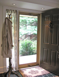
Deciding on window treatments for the side window/s that flank a front door can leave some in a window treatment dilemma. Many homeowners think that their only option is choosing between white sheers. Allowing sunlight in and gaining a little privacy are important considerations that I factor into my decision for a stylish window treatment, however I never go with a white sheer.

Here's the treatment I did for the side window at our front door...it's a sheer, but not white.

There are so many fabulous textiles to choose from...pick one, have it hemmed four inches on each end for a more substantial look and you've got yourself a wonderful window treatment! Or you can take a curtain and have it hemmed in the same fashion. The point is you don't have to buy a window treatment that is made just for a particular window...go for something stylish and functional!

Tuesday, September 7, 2010

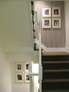
Staircase transformation completed!

Last week I posted about transforming two stairwells in our home. They had served as photo galleries, but lacked the "wow" affect that I desired. I have completed hanging the chocolate and white striped wallcovering in the two spaces and have achieved my desired result.    

Before.

Heading upstairs.

Heading downstairs.

In transition.


After. 

Staircases and/or hallways are often overlooked "possible gems" in interior design. I highly recommend creating "rooms" out of these otherwise lifeless spaces! 

Monday, September 6, 2010

Hamptons Happiness

The weather this summer was amazing and provided the setting for many quintessential summer weekends. All season long I've been doing a series called Hamptons Happiness, sharing all things Hamptons related that make me happy! As summer comes to end, I can't speak of the Hamptons and not share with you where I spent many weekend moments...poolside!

I could be found here playing with my children, hanging out with friends or reading Hamptons Cottages and Gardens ( a great regional magazine devoted entirely to the Hamptons design and lifestyle scene!)
Happy "Hamptons" Monday! 

Thursday, September 2, 2010

Wastebasket options

I loathe the idea of walking into a bathroom, guest room or home office and seeing a garbage can full of trash. It just looks dirty, but emptying a wastebasket every hour isn't realistic either...so, what's the solution? In rooms where I am not able to tuck a trashcan out of view, I use light weight metal umbrella stands. They are tall, so trash settles to the bottom out of sight.  Here's a fun Kelly green zebra striped one! 
Here is another one that is in our half bath.
Now, my absolute favorite garbage "tote" is the one designed by Bunny William's line of home furnishings, BeeLine Home. I'm ordering this one to use as either a magazine holder in our living room or in my office for debris, still deciding! This "tote" makes a stylish statement regardless of which room it is placed!

Not only are the above options functional and stylish, they are also practical...just wipe them clean with a rag. I'd love to hear what you use so that garbage is not in plain view upon entering a room!